
Availability & Pricing
Better product configuration with progressive disclosure
Role
Duration
Product Designer
6 - 8 Months
Team
Product Manager, Customer Support, Business Operations, Sales and Account Representatives, Research, Data Analyst, Engineer & Content Designer.
The challenge?
I jumped into this project after the previous designer moved to a different team. During my first few weeks, I had to get up to speed with all the background info, team dynamics, and earlier discussions. The goal was to keep things moving forward smoothly while I was adapting to the new team.
Context
As part of the GetYourGuide product landscape, I worked on the B2B platform where tour operators (suppliers) can submit their activities, set prices, add offers, and manage their businesses.
After I joined, the entire B2B group conducted a UX audit based on multiple use cases, each was owned by a specific mission team or squad. One of the cases examined was “How they set and manage their prices and availability,” and the results were below expectations.
Skills
Design Sprints
Prototyping and Interaction design
Leadership and Team Collaboration
Strategic & Critical Thinking
Creative Problem-Solving
Product and Technical Sense
User Research
Stakeholder Management
🎯 Objective
Building a more intuitive experience will enable Self-service, reduce platform cost, and improve supplier onboarding rate.
Building an expandable foundation will enable us to scale functionalities that will fit the needs of a bigger diversity of suppliers.

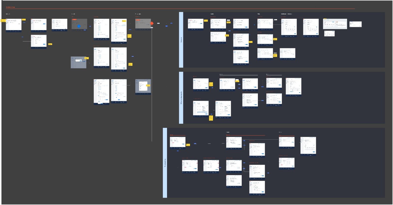
How the project looked like before and after I joined the team.
GetYourGuide's Availability & Pricing (A&P) section was a critical touchpoint for suppliers to set up their tour offerings. However, the existing interface presented significant usability challenges. The system was forcing suppliers to follow a complex logic that didn't match their mental models, particularly in separating pricing from availability. This resulted in suppliers creating workarounds and "hacks" to set up their pricing, leading to frustration and inefficiency.
🚦 The starting point
“I really don’t know how I did it, I don’t know how the system did it…”
“You need to make this simpler for people like me...”
Our target on Key Metrics:
New tour options creation rate:
20% improvement
Tour submission rate:
20% improvement target
Feature Adoption:
20% improvement
🔬 Interviews and concept testing
We conducted 10 in-depth interviews with suppliers who had recently set up their products, ensuring fresh perspectives on the current system's challenges.
The research specifically targeted a diverse group of suppliers from North America and Europe, including accounts managed and unmanaged by a sales representative. This phase revealed critical insights into how suppliers thought about pricing and scheduling, which often differed significantly from the system's structure.
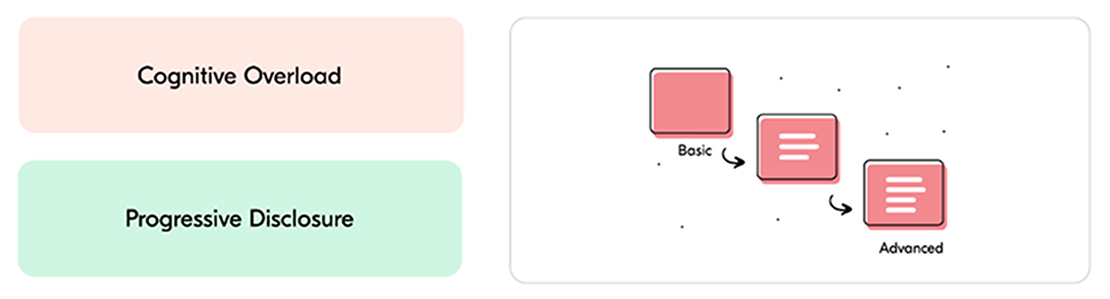
1) Having all the options on the same screen, was creating a lot of confusion and felt counterintuitive on what steps to follow to complete the full pricing set-up.

2) Not clear guidence on what to do next, technical jargon and not system feedback increased frustration throughout the process.

3) The current set-up was not following customers mental model or even other platforms they’re used to in a daily basis.

4) Need to more flexibility, more specific functionalities for complex scenarios and total control of their business as their main priorities.
As the product scope was so big, I teamed up with our Product Manager to break it down into manageable pieces. We dug into the learnings of the research and working sessions with our direct stakeholders and found some pretty clear patterns. Instead of trying to solve everything at once, we mapped out what was needed to be in our first release.
We looked at:
What suppliers were actually struggling with (turns out, almost everyone had trouble with the basics)
Which problems were causing the most headaches
What we could realistically build and ship quickly
What could wait for later versions
This way, we could get something useful out the door quickly while keeping the door open for all the cool features we wanted to add later. Best part? Our user testing showed we were on the right track - going from 0% to 100% task completion in our tests!
📝 What to prioritise?

📲 Defining the user flow
Main challenges of this project:
The content strategy to build an effective structure for all the necessary information to finish the setup and reduce tech and business lingo.
Technical constraints started to arise not only during the discovery phase, but also we got some surprises even during the implementation, that we didn’t know about it.
Speed vs clarity, we received some pushback from stakeholders as we were increasing the amount of steps needed to complete the configuration, but clarity over speed was our main focus.
No design system in place required a redefinition on how we worked as a design group. Reusing old components, creating the best experiencies keeping consistency without afecting quality was a true challenge
Keeping it agile, despite the size of the project. We worked hard implement, learn and iterate as fast as possible without compromising quality and the experience of our users.
Understanding that not only manual configuration but also automatic setups from API connections are needed to fit on the product, increasing not only the scope but also the use cases
👩🔬 Final experience


📊 Impact
Increased completion rate:
Before: ±40% -> After ±65%
Availability (seats) on tours
Before: ±30 -> After ±60
User satisfaction